
Gathr
a messaging management system that syncs content from all messaging apps seamlessly to simplify your digital communication experience.
Problem Statement
People who travel frequently or live overseas need a way to consolidate and simplify all messaging services because their contacts use different apps. This creates user friction by putting the undue burden of having to constantly switch from various messaging apps to keep up with all their contacts abroad.
Research
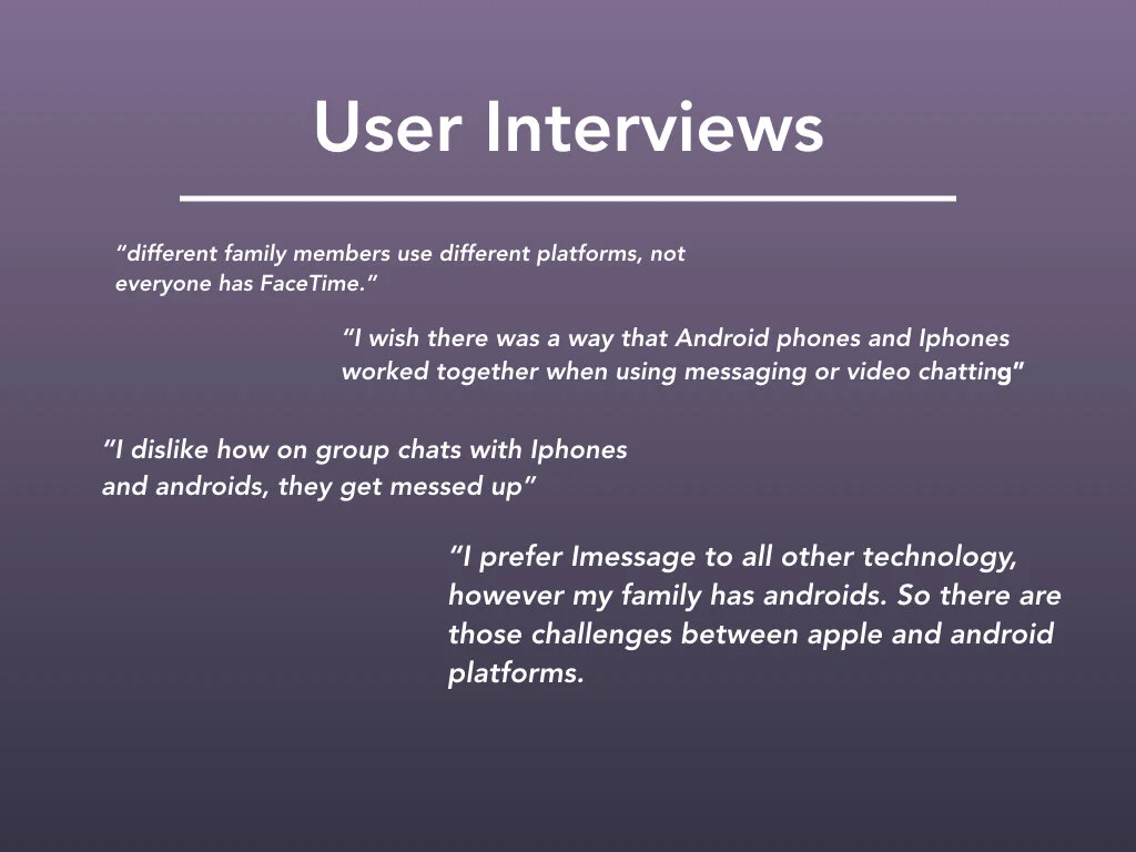
3 interviews with xennial users, M/F ages 32-35
All interviewees were tech savvy with varying degrees of travel frequency. They all shared the common challenge of staying in touch with friends and family across the world. Another common theme identified was the issue of cross platform connectivity. People use apps to bridge the gap between Android and Iphone mobile devices. Using these apps creates another problem, multiple contacts use various applications, so the user is flipping between all their messaging apps and its hard to keep track of it all.
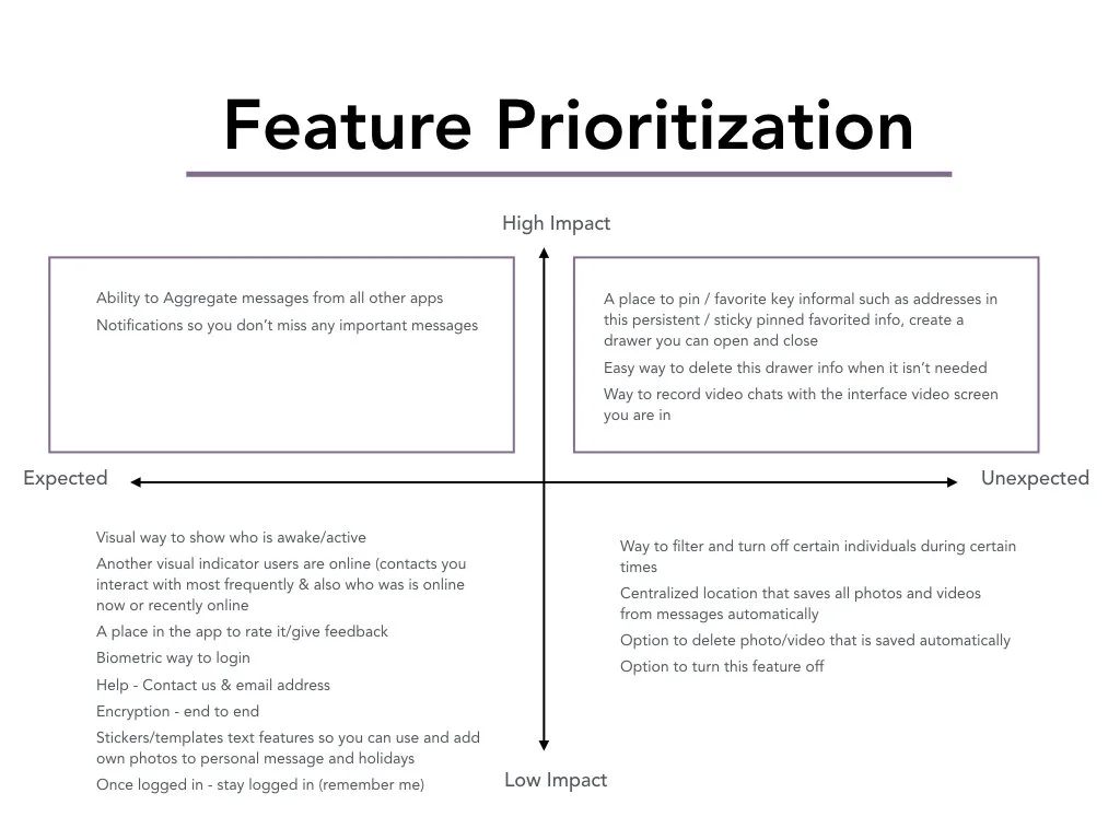
User stories (tasks) + Features
» What do your users need to accomplish?
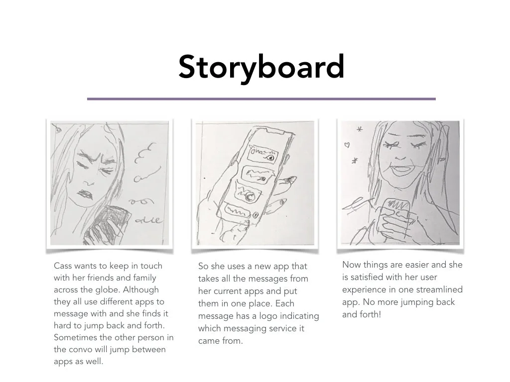
Users needs to keep in touch with friends and family overseas. Since she travels internationally frequently one of her main frustrations is lack of internet connectivity / bad cell service no coverage.She wants a place within the app or imessage where all her photos and videos are. Right now if she doesn't save a photo or video from Imessage, its hard to find. Same with directions or appointments. She wants a centralized messaging manager that corrals all incoming messages from every app she uses.
» What features will support these goals?
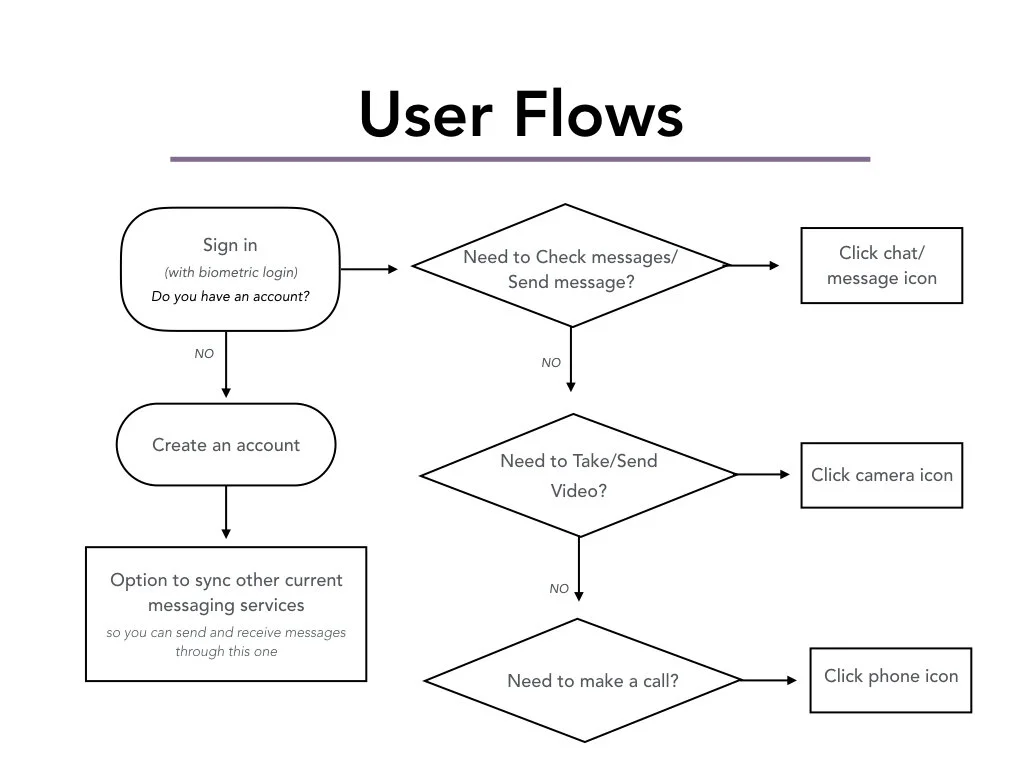
The main purpose of this app would be aggregating all the users messages from all their messaging applications . The main feature of this application would be having a centralized location on their mobile device that they can go to to send and receive their messages. Another feature would be the pin/favorite bar where they could copy and paste key information (from texts) in real time. My users are all very busy on the go individuals and need key information now. They do not have time to scroll through endless threads of text messages.
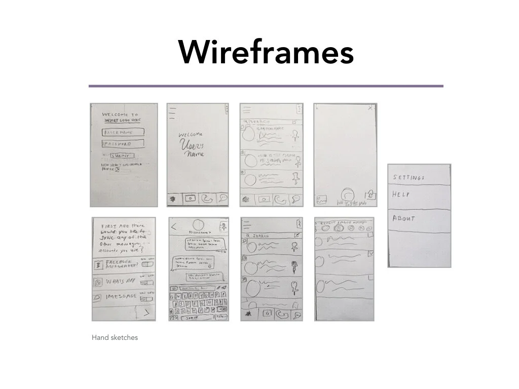
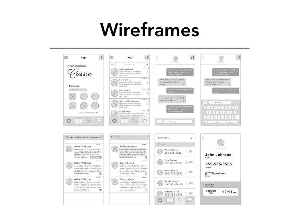
Usability Testing Learnings
» Icons were confusing
The camera icon was so simple it was confused with an icon of a dollar bill. The settings icon which is a gear was mistaken for a health symbol
» Navigation elements were getting cropped
The navigation elements such as arrows and tool bars were getting obscured in InVision. This made navigation and understanding the functionality of the tool bars more challenging
» Avatar element
The avatar element in the messaging section was missing the messaging logo identifier. This element is key for the user to identify the origin of each message. Whether it came from iMessage, Facebook Messenger, etc. Once I implemented that design change I needed to come up with a way for users to tell which of their contacts are online. I created a ring of color indicating activity around the users’ contacts photos. Green indicating online, red indicating offline.
Next steps
»Continue Iterating & testing with users
Apply learnings from usability test in next iteration and continue to increase fidelity of wireframes.